MyNeu: Things have only gotten worse 06-18-2004
A year ago I wrote a paper on improving the usability of Northeastern University’s student portal known as MyNeu. I sent this paper to the people in charge of MyNeu in hopes that they would hear the message from the people and maybe even implement some of the suggestions which I had made.
Unfortunately I can only assume my paper fell on deaf ears as since the time of that writing MyNeu has only become worse. I feel it is my duty to provide an addendum to my paper because of the latest changes which have been made on MyNeu.
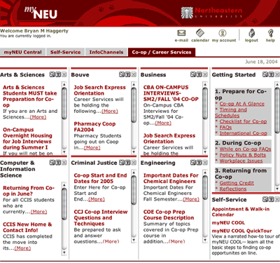
For this entry I am focusing on MyNeu’s “Co-op / Career Services” section. This section is to provide students with a central location to find information on the co-op program for their particular college in the University.

Figure 1. Co-Op Services section design [View Full Size]
What this section suffers from most is information overload. I had outlined in my paper stating that a major goal Northeastern needed to take on was to discover and understand its users. The user group of students is just too vague and really needs to be more broken down. The user groups need to be drilled down to components such as what college the student attends or even whether the student is a student living with disabilities. Much of MyNeu is too generalized and not geared to the correct demographics.
From the provided screenshot of the Co-Op section we can see a multitude of major problems just at face value. The fact that MyNeu does not cater to their users properly becomes severely apparent by the presentation of Co-Op information for every college in the university. The majority of students at Northeastern belong to only one college which means that roughly 70% of the information displayed is useless to all users. The presentation of useless information increases the cognitive load of the user and ultimately makes the service that much more difficult to use. Much of the screen real estate is also wasted on this useless information. Thus the user is left to work in a tiny space rampant with scroll bars and pop-up windows in order to find the information which they are looking for.
I spoke heavily in my paper about how users on the web read and one of the greatest points I mentioned was that users prefer to not have to scroll to find the information which they seek.
The lack of screen real estate posed a problem for MyNeu on how to actually display the information, so they resorted to utilizing an excessive amount pop up windows. The majority of the site is contained in a series of pop-up windows. Strategies such as these make it difficult for users to find their position in the site and make it difficult to navigate easily especially when pages have non-descriptive titles such as “Campus Pipeline” and simply “Northeastern University”.
What can be done to solve this problem?
MyNeu already knows what college you attend and with that information it can present the user with the proper information which pertains to that user. Some may ask what if a user wants to find out about another college. Providing simple text links to those sections solves the problem for cross browsing other college information.