An Example of Inconsistent & Poor Form Design 01-05-2005
Web applications are becoming more and more prominent, as are the html forms which comprise the method of interaction for these applications. Through the use of a simple example, I’ll discuss some of the good and bad points behind this example’s form design in terms of instructions and form actions. Additionally I’ll cover some tips on how to identify and avoid these problems.
I recently came across a simple example of inconsistent form design at the SallieMae website. Due to that I rarely login to this particular website I needed to find out what my user ID and password were. To attain this information it is necessary to access both their Forgot user ID and Forgot password forms. Two very simple forms, let’s take a closer look into the components of the forms.
What They Got Right
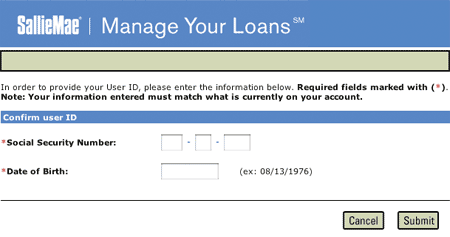
The forgot user ID tool, shown below in Figure 1, is extremely straight forward. Clear instructions are provided to the user conveying what is needed from them and what will occur upon completing the form. The form’s action buttons located to the lower right give the user not only the ability to commit the request for retreiving his user ID by pressing Submit but also an exit strategy with the Cancel button.

Figure 1
What They Got Wrong
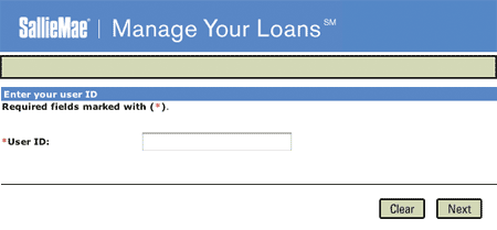
The forgot password form, shown below in Figure 2, unfortunately fails to follow the precedent set by the forgot user ID form. One of the main problems with the form is that it does not provide the user with instructions or information about what will occur upon submitting the form. Will the password be emailed? Will the user be asked to enter a new password?
The user is then presented with two possible form actions, both of which do not correspond to those presented in the forgot user ID form, Clear and Next. Upon pressing the clear button the contents of the form’s text field will be erased. This would be considered an extremely weak exit strategy as the user is still positioned at the form. Typically clear buttons are frowned upon as it is not likely that a user will fill out an entire form only seeking to erase it all, at least in this form there is only one field. In the case of using a clear button, even a cancel button for that matter, the user should be prompted to confirm the action. Additionally, on a broader note, the page offers no link back to the home page, not even the SallieMae logo, which could have been seen as an exit.
The use of Next as a form action is usually reserved for forms which have multiple form pages. While that may be the case for this form the user has no knowledge of that. If multiple form pages are going to be used, the user should be provided with such information. This can be in the form of stating that the form process has, for example, three steps.

Figure 2
What This Can Lead To
The user not knowing what is required of them can lead to frustration and form drop outs. As for this example, a user could possibly end up calling SallieMae’s phone support, which ultimately can lead to increased costs.
Lessons Learned
The best way to minimize these types of problems is sticking to the conventions which are used by countless developers. At the least, stick to your own conventions. That was the problem with SallieMae, they got some things right but failed to implement those methods across their other forms.
Another thing to consider is that whether you use submit, enter, or send be consistent throughout your forms. As users become more familiar with your site they will become more comfortable if there is a coherent voice. You don’t want users second guessing the meaning of your form buttons.
Most importantly, provide users with clear and proper instructions. As the developer, a form’s use seems idiotically clear but that is a horrible assumption to make. If possible test the form with users, even if they are just co-workers or friends.