My History on the Web 02-26-2005
Over the past 10 years I have made my mark on the Web in some fashion. Whether it was my PC bashing Mac centric homepage of the mid-90s, the rave fueled Haggs 2.0, or the currently professionally focused Losing Context, I have a history on the Web. With the remodeling of Losing Context I decided to provide a little insight into the past of my time on the Web.
1995
My first foray into the Web should be prefaced with a piece I wrote back in ’96 about learning HTML and my proficiency in making web pages:
I’m a MacUser and well I get the magazine MacUser (now MacWorld). So about one year ago MacUser had a little feature on some simple html tags to start creating web pages. I started getting into trying out some of these codes which I had no idea what they meant. Get this I wasn’t even on the Net yet. I was using AOL’s crappy web browser at the time. Once I made it on to the net with my own account I started looking into html again because I thought maybe I should make a page for myself. So I took a stab at making my own homepage. Although it wasn’t the best page I now had a name for myself on the net. Anyway to make a long story short I have been doing webpage creation for about a year and just now do I really consider myself pretty good at creating web pages. The reason is because I am now working on a commercial site and I am really working to make things better.
It is interesting to see how naive and albeit somewhat arrogant I was about my skills. What makes my comments back in ’96 so funny today is when viewed in the context of what my web pages actually looked liked. Figure 1 provides a glimpse of my presence on the Web in ’95. Keep in mind that at the time sites like Yahoo looked like this.
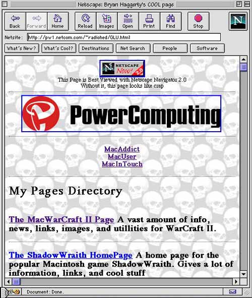
Figure 1. My Personal Web Page in 1995.
1996
By 1996 I was flying high. Some of my web sites were even winning awards such as Mac Addict Boosters Club’s Site of the Week and Mac Game Gate’s Site of the Month. Granted at the time almost every web site out there was giving away awards just to get you to put their badge on your site. Figure 2 shows a view of the award winning goodness.
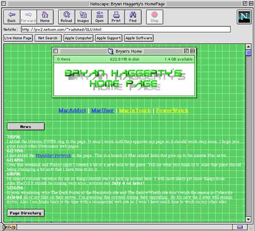
Figure 2. My Personal Web Page in 1996.
1997
My interest in web development began to waver by ’97, as can be seen in this dark rendition of my web page featured in Figure 3. Working on sites for other businesses provided little time for me to focus on my personal sites.
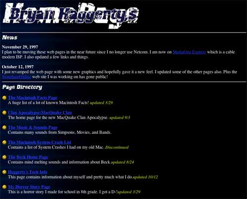
Figure 3. My Personal Web Page in 1997.
2000
After a long hiatus, 2000 brought a much fresher look to the personal web page. To ring in this total revamp, the page was adorned with the title Haggs 2.0.
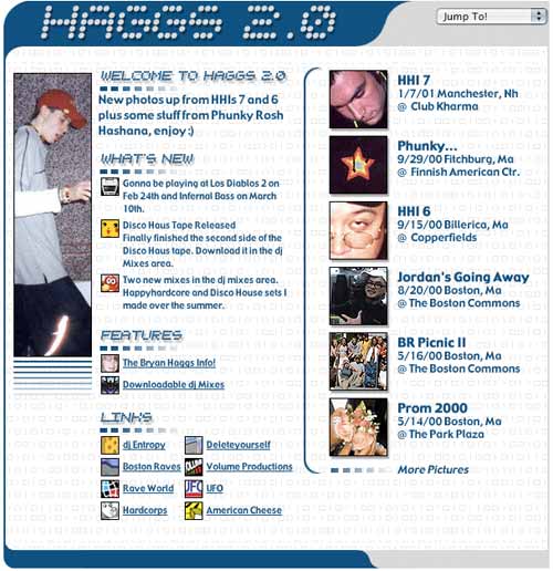
Figure 4. Haggs 2.0 in 2000
2004
Context is lost. Many have asked what is meant by the title of Losing Context. My intentions for the site were to discuss a variety of topics which in many ways were out of context in relation to each other. The site’s features ranged from my ramblings about usability and music to that of the presentation of my portfolio and photos.
Up until Losing Context the pages and sites I made for myself and work were based around the design model most famously depicted in Siegel’s Creating Killer Web Sites–using tables and single pixel gifs for layout. The design of Losing Context, as seen in Figure 5, brought about my first full implementation of web standards and CSS.
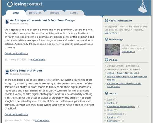
Figure 5. Losing Context in 2004
While it is interesting and more likely funny to see my past 10 years on the Web, it shows how there is no perfect design. We design to answer a problem or just to provide a change of scenery. Over the past 10 years my needs for my web site have changed. Today I share digital photos, something fairly uncommon in ’95, and my web site needs to provide that feature. I’ll soon tire of the design I have now, much like how we get bored seeing the same color walls. Eventually new technology and the tiring of a color scheme will employ me to redesign once again. But it’s not all for not, this is an iterative design process. Over the years my site has become more aesthetically pleasing, richer in features, and more importantly, easier to use.