Conveying Information Visually 03-12-2005
Various research has proven that people do not read the Web in the same manner which they would read a book or a magazine. In the fast paced Web, people are task oriented, relying on quickly scanning Web pages to find their desired information. Conveying information in a visual manner can help augment this form of information retrieval.
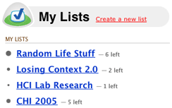
37Signals’ Ta-Da Lists, a Web-based to-do list application, provides users with a simple visual cue to show approximately how many items are in a particular list. List bullets enlarge in accordance to the amount of items contained. Figure 1 shows how a user can quickly attain useful information merely by glancing at the page.

Figure 1. Ta-Da Lists
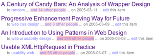
The social bookmarking service, Del.icio.us, uses visual cues to convey information about the amount of people who have also bookmarked a particular link, shown in Figure 2. As more people bookmark the link, the element, which states how many other people have bookmarked it, becomes a darker red. Unfortunately, the dark red does make it difficult to read the information.

Figure 2. Del.ico.us
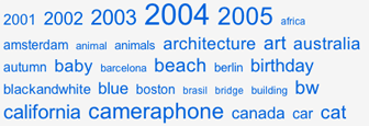
The Flickr photo sharing service uses variations in font sizes to convey information about the popularity of photo tags. As popularity in a tag increases so does its font size. Simple, but effective. This method is also implemented here at Losing Context.

Figure 3. Flickr
Methods such as the ones discussed here show the trend towards minimalist design, which provide great benefits. As Web professionals, we must cater to the needs of the users. That is to say, it is imperative to develop in accordance to how they use the Web.