Innovating Online Travel Sites 03-22-2005
Competition is stiff in the online travel site business and usability innovations will be a great factor in determining the top sites. AOL has recently released a beta version of its new Pinpoint Travel service. With the user in mind they have developed a simple and easy to use Web site which effectively works with the user. Highlighted are areas of novel design strategies.
Goal-Oriented Design
Users come to a travel site such as Pinpoint Travel with a specific goal in mind, find cheap flights, quickly and easily. Pinpoint Travel brings this goal to the foreground with an interesting technique. As can be seen in this Accompanying Screenshot, once a user has focused on the flight search box all other elements are faded into the background. Conveying to the user that this is the primary area to be interacting with.
Persistent Feedback
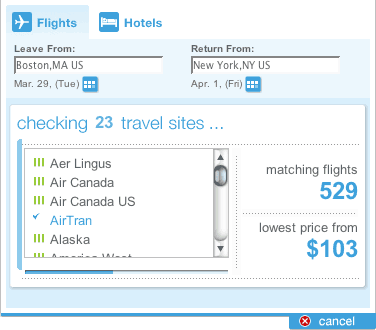
The more aware a user is of what an application is doing the more comfortable they will feel using it. Incessant stopwatches or blinking lights leave the user unaware of what the application is doing or how long it will take. Pinpoint Travel puts it all out there for the user, as shown in Figure 1. Search status is continually updated with which airlines have been searched and what is the current lowest fare. A progress bar also conveys to the user an estimated point of completion. Additionally, if a search is taking longer than expected Pinpoint Travel asks the user if they wish to stop searching and use what results have been found.

Figure 1. Pinpoint Travel’s effective use of persistent feedback
Minimalist Design
Give the users what they want. Thankfully, more and more sites are stripping the clutter and giving the users what is they are looking for. As stated, users have a goal-oriented approach when using sites such as Pinpoint Travel, do not hinder them from achieving their goals. This Accompanying Screenshot provides a look at how Pinpoint Travel gives the user a simple and easy to use results matrix. The user’s attention is not distracted by other offers or advertisements. Additionally, while other sites just present an excessively long scrolling list of results, Pinpoint Travel provides useful short, paged results. This shouldn’t be surprising; the most frequently chosen flights will most likely be within the top twenty on the first page.
Friendly Language
All too frequently, applications put users in the subordinate role, where the user is working for the application. In reality this should be the other way around. It is not uncommon for applications to demand input from a user. Would you shop at a store in which employees always acted in a demeaning nature? Probably not, or at the least you would avoid it. The same goes for Web applications. With the multitude of online travel sites, most users will pick the one they feel most comfortable with. A site where they feel like they are in control.
One method for achieving a good rapport with users is friendly language. Speak to the user on their level in a casual tone. Remember, the Web application is working for the user, not the other way around. This is especially relevant for e-commerce sites that want users to purchase a product or service. Figure 2 shows a good example of how Pinpoint Travel utilized friendly language. “OK, you’ve got…”, is simple, concise, and natural. PinPoint Travel provides casual banter, which more closely resembles communication between people.

Figure 2. Pinpoint Travel’s effective use of friendly language
Conclusion
AOL spent a lot of time researching how people use travel sites and what they want out of them, and it shows. In a market with many big players innovation is the only way to differentiate. Next time I am need of a flight I’ll be sure to check out Pinpoint Travel.