Improving the Tag Cloud Through Color 10-11-2005
I know, why are we still talking about tag clouds? The concept is becoming a bit cliche as of late, but they’re still a viable option for presenting information visually. Although, a problem with tag clouds seems to be that their scaling ability is limited. But there are ways to improve its scalability.
As an avid Flickr (king of tag clouds) user, you can imagine my list of photo tags is getting larger over time. Thus the tag cloud which represents my photo tags is becoming increasingly difficult to quickly acquire comparative information of my tags, based soley on font size.
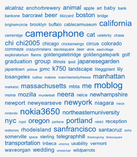
The visualization of varying font sizes becomes almost useless when viewing a tag cloud which approaches the length such as mine (Figure 1). Tags begin to blend together and it becomes almost more difficult to determine differences between tags as well as lowers their findability.
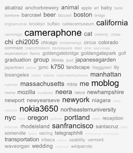
By using a gradient of color in addition to varying font sizes we can bring more depth to the tag cloud and augment its ability to emphasize popular tags (Figure 2). The variations in color almost give the tag cloud a 3D representation, pushing the popular tags to the front while de-emphaszing the less popular tags.

Figure 1. Current Flickr tag cloud with varying font sizes representing popularity

Figure 2. Modified Flickr tag cloud with varying font sizes and colors representing popularity
The traditional Flickr tag cloud works well for lists with few elements, I don’t think the addition of color would provide significant improvements for such tag clouds. There seems to be a threshold where merely using font sizes is not enough and color could be added to assist.