Little Things In UI Can Go a Long Way 11-29-2007
I have often felt that a great user experience can be defined by the little things. They’re the elements of an interface which pop up just when you need them and disappear when you don’t.
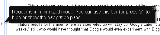
A nice example of this, is one I noticed today while using Google’s News Reader application. There is a subtle feature which by clicking a little arrow, minimizes the navigation pane to allow for more screen space for news content. It’s easy to miss, but it’s really a minor feature I think only a few people will truly take advantage but certainly a useful one to have.
Its subtly unfortunately can open a door to confusion, if a user were to accidentally click the little arrow. The user unaware of what has occurred, is left with an interface missing a major navigational element. But Google handled this issue with a little thing–a simple speech bubble informing the user upon the first time they use the feature that it is in minimized mode. And from then on, it disappears–there just when you need it and gone when you don’t.
What We Can Lean From This Example
Examples such as these display the difference between simply meeting a set of functional requirements and making a great user experience. When it comes to timelines and budgets, sadly these little things are the first to go. It can certainly be a battle to get the little things included, but as this example shows, it is a battle worth taking on.