Reducing the New York City Subway Map 11-20-2007
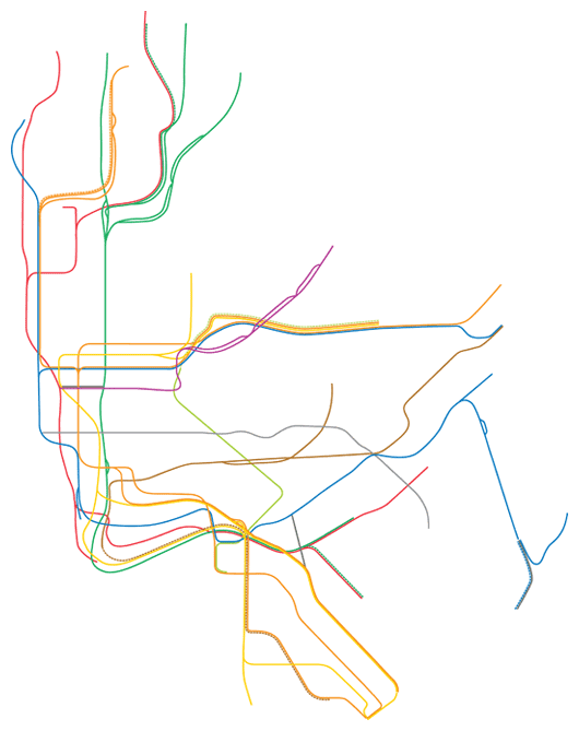
As a New Yorker and avid subway fan, each day I admire the New York City subway map, designed by Michael Hertz. It is certainly a great piece of graphic design and a cultural icon of the city. Its representation of subway lines and geography is burned into many of our heads. I sought to reduce the map to its simplest form, the contouring lines which depict each subway line’s route. To remove the geographical context in order to expose the grand complexity of this weaving system of people movers.
This reduction evokes an interesting view into the history, sprawl, and the expansiveness of New York City’s subway. Through abstraction of the subway map, the often spoke of, subway as the arteries of the city, is made unequivocally clear. No borough or neighborhood is given prominence, only its veins are shown, almost like a medical illustration of the human circulatory system.
Through breaking down the gestalts of the subway map, with each layer different interpretations can be made. The map below could certainly be broken down more to emphasis different components.