Google Maps mobile, displaying location based on cell tower usage
Keeping people informed with timely, contextually relevant emergency, transportation and other public interest information can prevent people from getting in harm’s way or to plan more accordingly to subway delays, just to list a few. Unfortunately, such information is often posted after the fact or on some obscure website that people need to check to discover if there is an issue. And major news outlets are typically not useful for the more macro information which affects people’s daily lives.
New York City has just begun testing a mobile phone SMS alert system for selected areas, called Notify NYC, similar to San Francisco’s Alert SF.
But there is one problem inherent in these types of systems. They require setting which locations of the city to receive updates about. While people generally have a consistent routine, they are always on the move, and that means these systems leave potential gaps. Undoubtedly, people are at a greater risk in unfamiliar areas in regards to evacuation routes, locations of police and fire stations and hospitals.
Communicating every update regardless of a person’s location will greatly increase communication noise and decrease the effectiveness of the system and people’s perceptions of its quality–likely causing people to disregard updates or opt out of the system all together. To augment the current implementation, location specific messages should be sent to opted in people based on the cell tower which their phone is currently connected to. Thus providing contextual alerts, without any prior configuration of location preference.
There are occasions where I visit a traditional book store such as Barnes & Noble, as opposed to simply ordering on Amazon.com–albeit rarely. Visiting a local bookstore does allow for that browsing of printed material more easily than an online store and some people do take joy in lingering around the vast shelves. But when visiting a bookstore in search of a specific item, the process can be somewhat frustrating and like a treasure hunt–almost making you rather wait the three days to get it by mail.
Barnes & Noble stores offer a kiosk system which allows for a search of a particular item and tells what floor and section it can be found in, there’s even a picture of the book’s cover. Conveniently, this can be printed to aid in the search. Unfortunately, how big the book is in both thickness and height or what the book’s spine looks like is not known from the kiosk’s information. The kiosk’s provided book cover picture isn’t much help in finding the book as bookstores stack books vertically with their spines facing front–hiding the book cover from view. Resulting in the all too common, head tilt browse as the person attempts to read the title’s on the book spine, since they have no clue what the book’s spine actually looks like. The kiosk managed to get the person to the right location but fails at that critical point of actually easily identifying the physical book.
While the kiosk’s provided book cover picture is certainly useful in validating that that is the book the person wants, it doesn’t provide enough information as a wayfinding tool in relation to how bookstores are arranged. A simple addition to the kiosk might just be a picture of the book’s spine, as shown below.
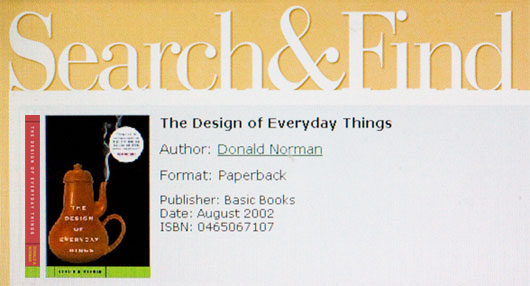
Barnes & Noble’s kiosk updated to show a picture of a book’s spine
Speaking with a friend recently about the fickleness of users, we inevitably came to the discussion of social networks and how users simply abandon one for the next.
The recent exodus from MySpace to Facebook, based solely on the amount of friend invites for Facebook in my inbox, would probably suggest how MySpace users are tired and bored of what they offer and see that Facebook has something at the least different. But in reality, there is probably more playing into this. Aside from MySpace’s spam issues and poor usability, user engagement has begun to dwindle. One of MySpace’s greatest points of bringing users back was the friend invite. A friend signs up and they want to connect, hence you come back and probably poke around the site for a bit while you’re at it. Eventually all your friends have signed up and you’ve connected with them all. It’s almost like collecting baseball cards. But once you’ve completed the set, now what?
The now what question seems to be the point at which users move on to something else. For some reason we as internet users have no problem creating new accounts, re-entering all the same data, uploading the same photos, and sending out invites to all the same people. Simply to start the same process over again.
Luckily, engagement is certainly evolving and the more modern social network tools are providing a reason to come back, and more than just to accept a friend invite. We can only hope that once you finish collecting your friends’ profiles you’ll be able to do more with them than just admiring your friend count.
Alerting users in a non-intrusive but informative way requires a bit of finesse. It is about providing information when it is needed but also not disrupting the work flow. When done right, it’s almost a natural assumed experience–seamless.
I was reminded of this in an unassuming place, not on a computer but at the grocery store. There are far more interactions at play in grocery stores than is often realized. In particular, in a grocer’s produce section where they seek to provide customers with fresh from the farm vegetables, the produce is kept clean and fresh by misting water on the produce–hopefully when a customer is not picking out vegetables.
In the past there used to be a person who would mist the produce with a water hose but today this process is mostly automated. But with the grocery store employee gone, customers don’t know when this misting is going to occur. The method employed to alert these customers of the misting, to possibly stand clear for a moment, is subtle but maps to a metaphor which requires no language, just an understanding of nature. Moments before the misting occurs the noise of a thunder storm rolls through. Thus informing the customer of the approaching rain showers, or mist in this case.
There are no spinning lights, bells, or muffled voices from a speaker to harshly grab the customer’s attention. Those are the obvious, thoughtless, and likely distracting methods. The thunder storm alert masterfully achieves its purpose unobtrusively of informing the customer but also plays into the whole experience of fresh produce, by pulling in other elements of nature.
I have often felt that a great user experience can be defined by the little things. They’re the elements of an interface which pop up just when you need them and disappear when you don’t.
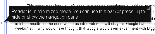
A nice example of this, is one I noticed today while using Google’s News Reader application. There is a subtle feature which by clicking a little arrow, minimizes the navigation pane to allow for more screen space for news content. It’s easy to miss, but it’s really a minor feature I think only a few people will truly take advantage but certainly a useful one to have.
Its subtly unfortunately can open a door to confusion, if a user were to accidentally click the little arrow. The user unaware of what has occurred, is left with an interface missing a major navigational element. But Google handled this issue with a little thing–a simple speech bubble informing the user upon the first time they use the feature that it is in minimized mode. And from then on, it disappears–there just when you need it and gone when you don’t.
What We Can Lean From This Example
Examples such as these display the difference between simply meeting a set of functional requirements and making a great user experience. When it comes to timelines and budgets, sadly these little things are the first to go. It can certainly be a battle to get the little things included, but as this example shows, it is a battle worth taking on.