iTunes Login Confusion 09-25-2005
If you use Apple’s iTunes Music Store you’ve probably had that moment of confusion when attempting to decipher the iTunes login prompt. What was meant to be a simple option of choosing whether your account is from Apple or AOL has led users to have to more closely evaluate what is being asked of them.
The login prompt, displayed in figure 1, goes against the typical linear fashion of form entry. Account type options are listed vertically alongside the username and password fields. Without any presentational separation or field label for the account type, the form is read from left to right and top to bottom. Figure 2 outlines how the current format is typically perceived by the user when scanning the form. The user is given the impression that the username field may only belong to the Apple radio button and password to the AOL radio button.
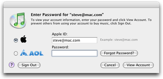
Figure 1. Current iTunes login prompt
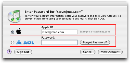
Figure 2. Current iTunes login prompt with emphasis
The root of this problem can be traced to the advent of AOL logins in iTunes 4.2. This new feature required Apple to redesign the interaction for logging into the iTunes Music Store. It appears that instead of more carefully investigating how to incorporate the option for AOL logins, Apple merely dropped the option into the, then current, prompt where space was available.
Figure 3 provides a simple redesign which follows the typical flow of how users interact with entry forms. Additionally, the user is provided with a field label for account type to provide extra guidance and consistency throughout the form.
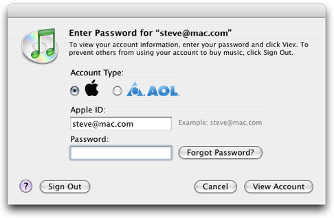
Figure 2. Redesigned iTunes login prompt
While this is a minor annoyance I have heard this complaint from more users than I would have imagined. Plus, I expect more from Apple as I know that they take even the most minor details into consideration when designing.