Having recently listened to the NYC CHI talk on UX career paths, I heard some interesting revelations on the perceptions of IA portfolios and gauging ability.
The greatest issue with IA portfolios seems to be that an IA can do many different things and as such their deliverables can be an assortment of artifacts. We see everything from a swath of wireframes to requirements documents and sitemaps, possibly personas or interaction flows–all of which are not necessarily glitzy. There is no one set of expected portfolio elements.
In fields such as graphic design, industrial design, as well as writing there are those portfolio pieces which are a given that they will be shown by any prospective candidate. Not to mention the context is often simpler to grasp for those fields. Attempting to briefly describe the interaction flow of a financial application to a layman can be complicated, unless reduced to simple constructs, at which point a fair amount of relevance is lost.
Kevin Kearney, of Razorfish, spoke of this portfolio issue in terms of hiring, stating that many times it is kind of a toss up and that you hope you make the right choice. But how you make that choice has a lot to do with seeing how a person performs, not necessarily just by looking at previous work. While probably not sitting a person down and asking them to design an application, at the least discovering how they tackle the common design challenges that arrive daily. This is even a time to determine how they work collaboratively, as a great part of designing is the discussion and how well someone handles that.
Similarly, members of the IxDA mailing list have spoken of this matter too. Noting the fact that a lot of great candidates may be passed over as a flashy portfolio is needed to even be considered.
What matters most is very simple, how a person thinks. They need to have the desire to learn, to be annoyed by things and have the drive to want to solve problems.
Google has just released, Street View, its latest feature to the Google Maps product. Essentially an enhanced version of Amazon A9’s now defunct block view. While impressive, I could not help but notice the lack of image quality of the panoramas. Although surprisingly, it seems this is a New York specific issue.
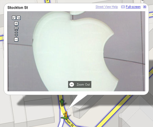
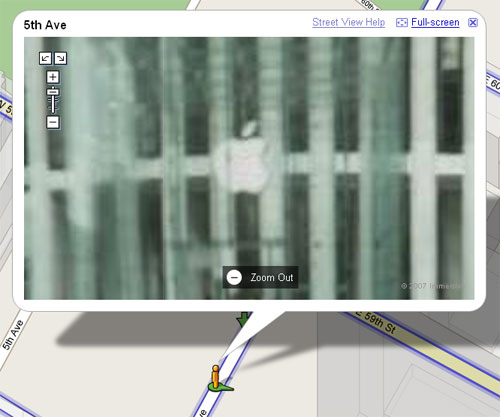
Shown below are two views of Apple’s stores in both San Francisco and New York City; of note is the difference in image quality between the two. San Francisco Street Views also have another additional level of zoom detail.

Figure 1. Google Maps Street View of SF Apple Store

Figure 2. Google Maps Street View of NYC Apple Store
I cannot envision what Google’s reasoning is for offering lower quality images of New York’s streets. My assumption is that identical equipment was used in shooting the panoramas for both cities. Security and privacy seem to be the only logical explanation (i.e., lower quality images mean in a city as populated as NYC you will reveal fewer recognizable faces).
Update: It appears that Google subcontracted their image capture work for New York out to
Immersive Media, while their San Francisco imagery was done in-house. This is solely based off the subtle copyright notice which is displayed in the lower right corner of the Street View image.
Prompting users about whether they would like to receive a receipt upon completing an ATM transaction is a long common practice. As is the practice of after printing one, immediately throwing it away. How are users interacting with these receipts and what can be done to reduce the waste as well as provide an easier and more secure experience?
Through examining ATM environments and the methods in which users interact with ATMs we can gain insightful details, especially around how receipts are used. To begin though, we must look at what types of information are provided on an ATM receipt; usually bank name, time, location, withdrawal/deposit amount, and account balance. These receipts often don’t travel very far from their birthplace–usually right into a trash can, which has been neatly placed at the foot of the ATM. Also in an odd bit of anthropological examination it is interesting to see how users dispose of their receipts; sometimes they are simply placed in the trash can, other times they’re crumpled up or even torn up into bits. The later methods appear to be some form of rudimentary security implementation (I must confess that out of habit I too tear my receipts up).
But so why is that we opt to print a receipt, create waste, only to view its contents for a few mere seconds? Banks have even gone ahead and accommodated this practice of printing and throwing away by placing trash cans directly next to ATMs–effectively solving the surface problem of ATMs being littered with receipts. Yet the greater problem at hand still remains.
It seems that often times users ask for a receipt simply to view their account balance. Upon completing an ATM transaction typically the only option offered is whether or not to print a receipt, when an ideal additional option would be to view the account balance.
I was recently thinking about how to exercise my mind to force myself out of the daily routine and came up with a challenge. Redesign any commonly used object.
This isn’t a ground breaking concept, but I think it’s an interesting method to keep yourself thinking and looking at how you interact with objects in your environment.
The redesign is to be quick and dirty, rough sketches, nothing too elaborate–focusing more on the idea than the delivery. There is no guideline as to what the redesign is to acheive, it may be increased usability, it may just be to look prettier.
Recently I was asked to speak at the Mobile Monday series in New York on the research I had worked on around text entry methods. It’s nice to see events such as these popping up, as it seems this field is under-represented by the professional design and usability organizations (upa, chi, ixda, etc).
The topic for the Mobile Monday event I spoke at was all about design and usability of mobile devices. Coming from a more research background it was interesting to see the other presenters talking about work which they have done that has actually made it into products.
In addition to the presentations, we participated in a panel discussion talking about our work and more importantly where the mobile field is going. My take is more wireless integration with other devices (watches–they’re coming back, kiosks, purchasing systems, etc).

