Spanning search results or any other kind of list of information across pages has become standard fare on the Web. Unfortunately this information is now secretly locked behind mystery doors (links) 2 through 34. How can we give the user insight into what lies behind these doors instead of simply choosing at random in order to find they information they desire?
Pagination has helped in reducing the load of information a user has to take in or download for that matter, but the pagination navigation leaves a great deal to be desired. Typically the pagination navigation is simply a list of linked numbers which reference each page of results, sometimes truncated to reduce an overload of page links. The problem with this is that the user is essentially gambling with what he will be presented with when clicking on a page link. Which is why most users don’t actually randomly pick a page, they walk through the results with the Next Page link.
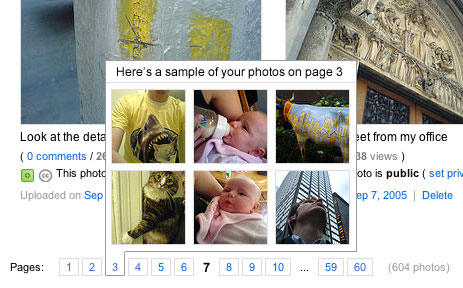
Jared Spool has talked at great lengths about the idea of information scent, basically giving the user an idea of what lies behind a link before they click it. Information scent can give a user a purpose to click a link. Pagination navigation does not provide the user with any scent as to what exists behind a link such as 4. When looking at an alphabetically sorted list of results, wouldn’t it be nice to be able to know that a particular letter was on a certain page instead of excessively clicking around? Figure 1 showcases a pagination navigation scheme with scent for Flickr. When the user mouses over a page link he is presented with a sample of the photos which exist on that page. Thus allowing the user to make a better informed decision about whether to proceed to that page or not.

Figure 1. Flickr pagination with information scent
I know, why are we still talking about tag clouds? The concept is becoming a bit cliche as of late, but they’re still a viable option for presenting information visually. Although, a problem with tag clouds seems to be that their scaling ability is limited. But there are ways to improve its scalability.
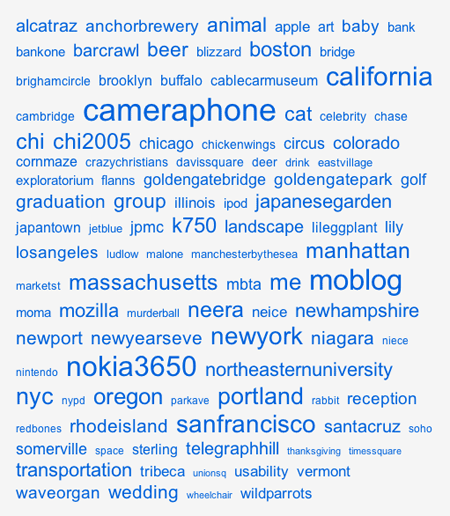
As an avid Flickr (king of tag clouds) user, you can imagine my list of photo tags is getting larger over time. Thus the tag cloud which represents my photo tags is becoming increasingly difficult to quickly acquire comparative information of my tags, based soley on font size.
The visualization of varying font sizes becomes almost useless when viewing a tag cloud which approaches the length such as mine (Figure 1). Tags begin to blend together and it becomes almost more difficult to determine differences between tags as well as lowers their findability.
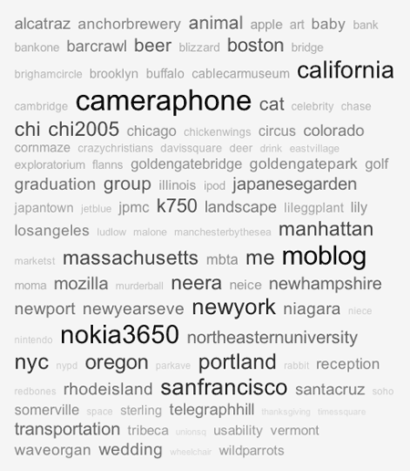
By using a gradient of color in addition to varying font sizes we can bring more depth to the tag cloud and augment its ability to emphasize popular tags (Figure 2). The variations in color almost give the tag cloud a 3D representation, pushing the popular tags to the front while de-emphaszing the less popular tags.

Figure 1. Current Flickr tag cloud with varying font sizes representing popularity

Figure 2. Modified Flickr tag cloud with varying font sizes and colors representing popularity
The traditional Flickr tag cloud works well for lists with few elements, I don’t think the addition of color would provide significant improvements for such tag clouds. There seems to be a threshold where merely using font sizes is not enough and color could be added to assist.
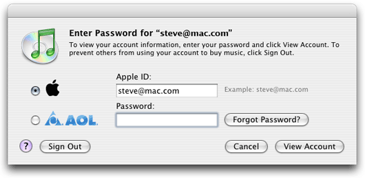
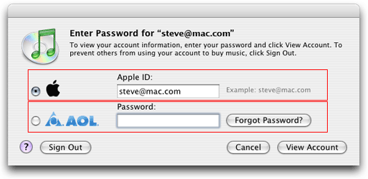
If you use Apple’s iTunes Music Store you’ve probably had that moment of confusion when attempting to decipher the iTunes login prompt. What was meant to be a simple option of choosing whether your account is from Apple or AOL has led users to have to more closely evaluate what is being asked of them.
The login prompt, displayed in figure 1, goes against the typical linear fashion of form entry. Account type options are listed vertically alongside the username and password fields. Without any presentational separation or field label for the account type, the form is read from left to right and top to bottom. Figure 2 outlines how the current format is typically perceived by the user when scanning the form. The user is given the impression that the username field may only belong to the Apple radio button and password to the AOL radio button.

Figure 1. Current iTunes login prompt

Figure 2. Current iTunes login prompt with emphasis
The root of this problem can be traced to the advent of AOL logins in iTunes 4.2. This new feature required Apple to redesign the interaction for logging into the iTunes Music Store. It appears that instead of more carefully investigating how to incorporate the option for AOL logins, Apple merely dropped the option into the, then current, prompt where space was available.
Figure 3 provides a simple redesign which follows the typical flow of how users interact with entry forms. Additionally, the user is provided with a field label for account type to provide extra guidance and consistency throughout the form.

Figure 2. Redesigned iTunes login prompt
While this is a minor annoyance I have heard this complaint from more users than I would have imagined. Plus, I expect more from Apple as I know that they take even the most minor details into consideration when designing.
It is almost a rarity to see a person with a walker which does not have the signature tennis balls on the back legs. The users of these walkers have filled a gap in the design to make the walker better fit their needs. But the real question is, why haven’t the designers of the walker taken notice of this very prominent “user hack”.
As a designer it is always fascinating to see how the users actually interacts with your design. This also poses as a means of feedback and a way to learn more about how users push the design. Typically the activity of listening to users’ feedback and observing their interactions is reincorporated back into the design process.
When people began to place split tennis balls on the back legs of walkers this should have been a clear indication to the designers that they missed something in their usability testing. But what is worse is that this process has continued for many years without any redesign of the walker.
Granted, new walkers such as those with hand brakes do exist to answer the shortcomings of the traditional walker. But, the tennis ball solution is a simple one, one which I feel could be easily reincorporated into the traditional walker. These people are just looking for a little bit of traction and the ability to easily slide their walkers. Not to mention the difficulty in slicing a hole in a tennis ball. Do medical supplies stores sell tennis balls to go along with the purchase of a walker?
This design shortcoming has even been taken advantage of as a business oppurtunity, the Walkerballs.
I recently heard a radio advertisement proclaiming, “Don’t change that dial”, a fairly common phrase in radio advertising. But as technology advances (eliminating dials in favor of buttons), sayings such as the aforementioned one are becoming irrelevant. This same progression is occurring in the metaphors we use in computing.
When the first graphical user interfaces were being developed the designers sought to ease the learning curve by making the user experience similar to one which they already knew–the desktop. Such a metaphor was an ideal implemenation. The computer interface contained all the familiar elements of that of a desktop–files, folders, sticky notes, a desktop workspace, and a trash can.
But what happens when the desktop metaphor becomes irrelevant because the computer has become the desktop? Today, when someone speaks about files or folders, it isn’t so out there to assume they are speaking about computer files. Will there be a time when someone much younger than myself will question why the computer is arranged as such? But then again, there is the possibility that the desktop metaphor will simply fade away as developers push towards a more Internet OS strategy than the traditional desktop environment.
