Reaching out of the development bubble to learn how users feel about and use an application or service can provide useful insight. It sounds like an obvious idea, but it is not always commonly done. Luckily it seems that Northeastern University is getting closer to realizing the benefits of such a method.
Over the course of two years I have identified some key areas of Northeastern’s MyNeu student portal system which I felt were hindering the overall user experience (readings available in the Related Links section). I had mailed my original research paper to Northeastern’s Information Services department in hopes of creating a dialogue to discuss ways to improve the MyNeu user experience. Nothing came of my efforts so I ultimately left it at that.
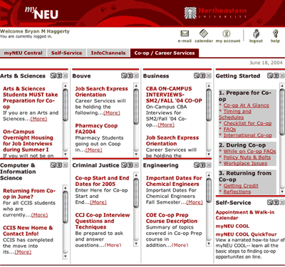
Recently MyNeu sought input from its users about the services they were providing–what new features to add, how to improve existing ones. I saw this as an opportunity to provide them with my thoughts on one of their most troubling areas, Co-Op Services. Much of my comments were drawn from my article titled, MyNeu: Things Have Only Gotten Worse. Harsh, but I truly believe this was a major fumble on their behalf. Luckily it seems that this time my comments were heard and action was taken. To preface this, figure 1 shows what the Co-Op Services section previously looked like. Providing equal screen real estate for Co-Op information from each college, when the user is really only in need of the information from their one respective college.

Figure 1. Original Co-Op Services section design [View Full Size]
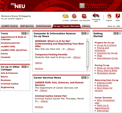
Based upon my comments stating how MyNeu should provide their users with information relevant to their specific needs (i.e., the information from their college), Figure 2 displays the updated version.

Figure 2. Updated Co-Op Services section design [View Full Size]
While this is my last semester at Northeastern, I hope that maybe my work can turn both users and developers to look more deeply into ways of improving the user experience of Northeastern’s offerings.
Related Links
The introduction of Google Maps provided a major push in innovating the online maps and directions services, which in turn has opened up new avenues for further innovation in this sector. Introducing visual representations of landmarks within directions can hopefully improve the success rates of correctly following directions.
Cognitive Maps
Research in cognitive psychology suggests that the way in which humans determine position and get around their environments is based upon a construct known as cognitive maps. Such maps can be seen as a mental representation of a person’s surroundings, typically loosely constructed and centering on relationships between landmarks (i.e., buildings, unique objects, etc).
It is not surprising then that a friend might tell you how to get a particular location based around landmarks rather than street names. For example:
To get to the Fenway, drive straight, take a right by Flann O’Brien’s, and then a left by Mass Art.
Directions such as these are based off a person’s cognitive map of the area. Identifying, categorizing, and remembering landmarks is far easier than attempting to read and remember street signs which have weak relationships to the environment. An exception to the case may be areas which have a structured naming convention for streets (e.g., New York City).
This is not to say that specific directions are not needed, but that they can be augmented to reflect how people actually travel and think about their environment.
Improving Google Maps based upon Cognitive Maps
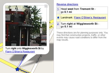
Figure 1 displays a modified version of Google Maps featuring support for landmarks. Using the example provided earlier, the user is now able to get a visual representation of the landmark, Flann O’Brien’s. Thus allowing the user to create relationships between elements of the enviroment.

Figure 1. Google Maps with Landmarks
Potential Revenue Source
The addition of landmarks also provides a potential revenue source. Many landmarks are places of business, which could possibly pay to have additional information displayed. Surprisingly such advertising could actually be useful to the user. They will be traveling to an area which they may be unfamiliar with but may wish to stop at a restaurant or store on the way.
Related Links
Competition is stiff in the online travel site business and usability innovations will be a great factor in determining the top sites. AOL has recently released a beta version of its new Pinpoint Travel service. With the user in mind they have developed a simple and easy to use Web site which effectively works with the user. Highlighted are areas of novel design strategies.
Goal-Oriented Design
Users come to a travel site such as Pinpoint Travel with a specific goal in mind, find cheap flights, quickly and easily. Pinpoint Travel brings this goal to the foreground with an interesting technique. As can be seen in this Accompanying Screenshot, once a user has focused on the flight search box all other elements are faded into the background. Conveying to the user that this is the primary area to be interacting with.
Persistent Feedback
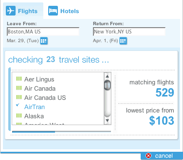
The more aware a user is of what an application is doing the more comfortable they will feel using it. Incessant stopwatches or blinking lights leave the user unaware of what the application is doing or how long it will take. Pinpoint Travel puts it all out there for the user, as shown in Figure 1. Search status is continually updated with which airlines have been searched and what is the current lowest fare. A progress bar also conveys to the user an estimated point of completion. Additionally, if a search is taking longer than expected Pinpoint Travel asks the user if they wish to stop searching and use what results have been found.

Figure 1. Pinpoint Travel’s effective use of persistent feedback
Minimalist Design
Give the users what they want. Thankfully, more and more sites are stripping the clutter and giving the users what is they are looking for. As stated, users have a goal-oriented approach when using sites such as Pinpoint Travel, do not hinder them from achieving their goals. This Accompanying Screenshot provides a look at how Pinpoint Travel gives the user a simple and easy to use results matrix. The user’s attention is not distracted by other offers or advertisements. Additionally, while other sites just present an excessively long scrolling list of results, Pinpoint Travel provides useful short, paged results. This shouldn’t be surprising; the most frequently chosen flights will most likely be within the top twenty on the first page.
Friendly Language
All too frequently, applications put users in the subordinate role, where the user is working for the application. In reality this should be the other way around. It is not uncommon for applications to demand input from a user. Would you shop at a store in which employees always acted in a demeaning nature? Probably not, or at the least you would avoid it. The same goes for Web applications. With the multitude of online travel sites, most users will pick the one they feel most comfortable with. A site where they feel like they are in control.
One method for achieving a good rapport with users is friendly language. Speak to the user on their level in a casual tone. Remember, the Web application is working for the user, not the other way around. This is especially relevant for e-commerce sites that want users to purchase a product or service. Figure 2 shows a good example of how Pinpoint Travel utilized friendly language. “OK, you’ve got…”, is simple, concise, and natural. PinPoint Travel provides casual banter, which more closely resembles communication between people.

Figure 2. Pinpoint Travel’s effective use of friendly language
Conclusion
AOL spent a lot of time researching how people use travel sites and what they want out of them, and it shows. In a market with many big players innovation is the only way to differentiate. Next time I am need of a flight I’ll be sure to check out Pinpoint Travel.
Various research has proven that people do not read the Web in the same manner which they would read a book or a magazine. In the fast paced Web, people are task oriented, relying on quickly scanning Web pages to find their desired information. Conveying information in a visual manner can help augment this form of information retrieval.
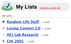
37Signals’ Ta-Da Lists, a Web-based to-do list application, provides users with a simple visual cue to show approximately how many items are in a particular list. List bullets enlarge in accordance to the amount of items contained. Figure 1 shows how a user can quickly attain useful information merely by glancing at the page.

Figure 1. Ta-Da Lists
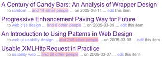
The social bookmarking service, Del.icio.us, uses visual cues to convey information about the amount of people who have also bookmarked a particular link, shown in Figure 2. As more people bookmark the link, the element, which states how many other people have bookmarked it, becomes a darker red. Unfortunately, the dark red does make it difficult to read the information.

Figure 2. Del.ico.us
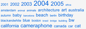
The Flickr photo sharing service uses variations in font sizes to convey information about the popularity of photo tags. As popularity in a tag increases so does its font size. Simple, but effective. This method is also implemented here at Losing Context.

Figure 3. Flickr
Methods such as the ones discussed here show the trend towards minimalist design, which provide great benefits. As Web professionals, we must cater to the needs of the users. That is to say, it is imperative to develop in accordance to how they use the Web.
As the adoption rate of RSS and news aggregators increases it is interesting to see how people’s use of the Web changes because of this simple technology. Although, are we approaching information overload? Is this a technology which average users can use? And more importantly, does the Web browser need to change to incorporate this new method of Web browsing.
Handling the Overload
As I sit here typing this I currently have 251 unread articles in my news aggregator. More often than not I end up hitting the Mark All as Read button at the end of the day. Not because I’m not interested in those articles but more so that there is a lot of noise. The news aggregator acts as an aggregator of link aggregators, so you get the point.
How can we cut through the noise and get at the news which interests us. This is a problem I always think about when I hit that Mark All as Read button. Because I constantly think I’m passing by a good article which would be worthwhile for me to read. If Apple Mail can successfully filter out junk mail based on my tastes why can’t a similar method be employed to solve the RSS glut problem? Through analyzing the articles which you do read it can build a profile of your tastes and highlight those articles so you don’t miss a beat on what you like. Granted, I may need to investigate the essence of how a Bayesian filtering system works. This seems like a next logical step and I’m surprised I’ve yet to see any of the major news aggregators implement it.
There has been talk about the methods by which a user subscribes to an RSS feed. From a user experience standpoint it is quite pitiful. The typical user does not know what XML is nor do they know what it looks like or what to do with it. Upon clicking an RSS link the user is presented with what seems to be giberish and is provided with no direction on how to use what they have been presented with. Method such as the feed:// protocol and plugins have attempted to solve this problem. But these still do not make reading and subscribing to RSS as easy as it should be. Total integration with the Web browser may be a better alternative.
Fitting in the Web Browser
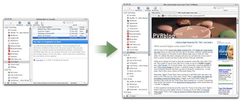
The only reason I’m leaning more towards the Web browser as the RSS aggregator is because of the realization of how I use my own news aggregator. Originally, I had a few subscriptions and relegated my news aggregator to a small window, shown in Figure 1, which I checked occasionally. Over time I have expanded the news aggregator to a size larger than my Web browser window. I began to more frequently use my news aggregator as a Web browser, even downloading files and checking email in it.

Figure 1. Progression of the News Aggregator
FireFox has limited RSS capabilities and Apple’s forthcoming Safari RSS doesn’t seem to go all the way either, for me at least. But, I do think these implementations are a great simple way to get average users into the RSS technology. So this does leave an open window for the current news aggregators who will continue to innovate through things such as Podcasting and features for advanced users.
