Google’s recently released Maps beta is likely to be considered more innovative than their GMail product. Especially when looking at the markets for each product. While GMail provided an unheard of, at the time, 1gb of storage, the competition quickly responded. This isn’t to say that GMail didn’t have an assortment of other great features, but with Google Maps they have completely changed the online map paradigm.

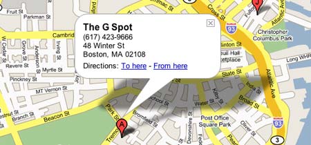
Figure 1. The new Google Maps.
One of the major drawbacks of map services such as MSN Maps and Mapblast is merely due to the nature of how the web works, a lack of continuous communication between client and server. Using typical online maps is like using a real map that you are not allowed to completely unfold, requiring requests to the server to unfold another piece of the map. Through technologies such as Ajax (XMLHttpRequest) Google Maps are draggable and easy to work with, without the need for page reloads. You could scroll from the East Coast to the West Coast if you so desired. When page reloads occur it is not uncommon for users to lose their location focus, requiring users to have to waste cognitive resources to reorient themselves.
Some Hidden Features
A feature that will probably go unnoticed by many is the dynamic resizing of the map area. Upon resizing the browser window the map view changes accordingly to fit the space. This is a great feature if you are a person with a high display resolution, as you will be presented with a large map automatically. This eliminates the need for Map Size buttons.
Just like in GMail, Google has added keyboard shortcuts for Google Maps. This is especially nice for scrolling around a map, by way of the keyboard’s arrow keys.

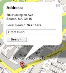
Figure 2. Local Search Bubble.
Location bubbles provide the user with a direct one to one connection between possible actions and the object which they will be applied to. This is currently only used for directions but could easily include Local Search features. For example as shown in Figure 2, Find great sushi near this location
Areas of Improvement
There are still a few quirks in need of fixing though. The fact that a user is forced to click a link to get a URL for the map is a bit of a hassle. Especially since most users are accustomed to being able to just copy the URL from the browser’s location bar. Additionally, it is always a bad idea to ask users for information which the system already knows. When a user has searched for a particular address and is now looking for directions to it, the application should employ some basic assumptions. The user is likely to be traveling from a fairly local location, (i.e., do not force the user to have to enter the city and state again for the origin location). This is not a problem exclusive to Google Maps, but an annoyance I have with all the map services.
Google is definitely hard at work on this product. In a short period of time I’ve noticed a fair amount of tweaks such as the altering of the Example Searches and better support for Apple’s Safari browser. What will be more interesting is how the competition responds to Google Maps, since it seems there is already a lot to catch up to.
Related Links
Update: It seems there is some discrepancy as to whether Google Maps uses Ajax or a method which uses a hidden iframe. According to other sources the hidden iframe method appears to be the most likely answer. This method seems to be similar to a technique which we used at Harvard called JSRS from Ashley IT.
Over the past 10 years I have made my mark on the Web in some fashion. Whether it was my PC bashing Mac centric homepage of the mid-90s, the rave fueled Haggs 2.0, or the currently professionally focused Losing Context, I have a history on the Web. With the remodeling of Losing Context I decided to provide a little insight into the past of my time on the Web.
1995
My first foray into the Web should be prefaced with a piece I wrote back in ’96 about learning HTML and my proficiency in making web pages:
I’m a MacUser and well I get the magazine MacUser (now MacWorld). So about one year ago MacUser had a little feature on some simple html tags to start creating web pages. I started getting into trying out some of these codes which I had no idea what they meant. Get this I wasn’t even on the Net yet. I was using AOL’s crappy web browser at the time. Once I made it on to the net with my own account I started looking into html again because I thought maybe I should make a page for myself. So I took a stab at making my own homepage. Although it wasn’t the best page I now had a name for myself on the net. Anyway to make a long story short I have been doing webpage creation for about a year and just now do I really consider myself pretty good at creating web pages. The reason is because I am now working on a commercial site and I am really working to make things better.
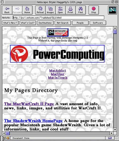
It is interesting to see how naive and albeit somewhat arrogant I was about my skills. What makes my comments back in ’96 so funny today is when viewed in the context of what my web pages actually looked liked. Figure 1 provides a glimpse of my presence on the Web in ’95. Keep in mind that at the time sites like Yahoo looked like this.

Figure 1. My Personal Web Page in 1995.
1996
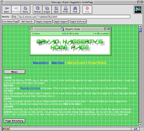
By 1996 I was flying high. Some of my web sites were even winning awards such as Mac Addict Boosters Club’s Site of the Week and Mac Game Gate’s Site of the Month. Granted at the time almost every web site out there was giving away awards just to get you to put their badge on your site. Figure 2 shows a view of the award winning goodness.

Figure 2. My Personal Web Page in 1996.
1997
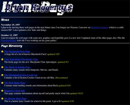
My interest in web development began to waver by ’97, as can be seen in this dark rendition of my web page featured in Figure 3. Working on sites for other businesses provided little time for me to focus on my personal sites.

Figure 3. My Personal Web Page in 1997.
2000
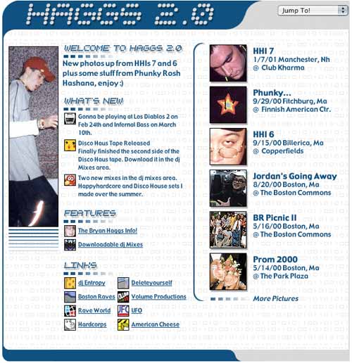
After a long hiatus, 2000 brought a much fresher look to the personal web page. To ring in this total revamp, the page was adorned with the title Haggs 2.0.

Figure 4. Haggs 2.0 in 2000
2004
Context is lost. Many have asked what is meant by the title of Losing Context. My intentions for the site were to discuss a variety of topics which in many ways were out of context in relation to each other. The site’s features ranged from my ramblings about usability and music to that of the presentation of my portfolio and photos.
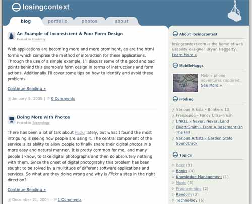
Up until Losing Context the pages and sites I made for myself and work were based around the design model most famously depicted in Siegel’s Creating Killer Web Sites–using tables and single pixel gifs for layout. The design of Losing Context, as seen in Figure 5, brought about my first full implementation of web standards and CSS.

Figure 5. Losing Context in 2004
While it is interesting and more likely funny to see my past 10 years on the Web, it shows how there is no perfect design. We design to answer a problem or just to provide a change of scenery. Over the past 10 years my needs for my web site have changed. Today I share digital photos, something fairly uncommon in ’95, and my web site needs to provide that feature. I’ll soon tire of the design I have now, much like how we get bored seeing the same color walls. Eventually new technology and the tiring of a color scheme will employ me to redesign once again. But it’s not all for not, this is an iterative design process. Over the years my site has become more aesthetically pleasing, richer in features, and more importantly, easier to use.
Web applications are becoming more and more prominent, as are the html forms which comprise the method of interaction for these applications. Through the use of a simple example, I’ll discuss some of the good and bad points behind this example’s form design in terms of instructions and form actions. Additionally I’ll cover some tips on how to identify and avoid these problems.
I recently came across a simple example of inconsistent form design at the SallieMae website. Due to that I rarely login to this particular website I needed to find out what my user ID and password were. To attain this information it is necessary to access both their Forgot user ID and Forgot password forms. Two very simple forms, let’s take a closer look into the components of the forms.
What They Got Right
The forgot user ID tool, shown below in Figure 1, is extremely straight forward. Clear instructions are provided to the user conveying what is needed from them and what will occur upon completing the form. The form’s action buttons located to the lower right give the user not only the ability to commit the request for retreiving his user ID by pressing Submit but also an exit strategy with the Cancel button.

Figure 1
What They Got Wrong
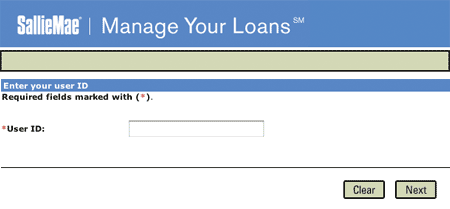
The forgot password form, shown below in Figure 2, unfortunately fails to follow the precedent set by the forgot user ID form. One of the main problems with the form is that it does not provide the user with instructions or information about what will occur upon submitting the form. Will the password be emailed? Will the user be asked to enter a new password?
The user is then presented with two possible form actions, both of which do not correspond to those presented in the forgot user ID form, Clear and Next. Upon pressing the clear button the contents of the form’s text field will be erased. This would be considered an extremely weak exit strategy as the user is still positioned at the form. Typically clear buttons are frowned upon as it is not likely that a user will fill out an entire form only seeking to erase it all, at least in this form there is only one field. In the case of using a clear button, even a cancel button for that matter, the user should be prompted to confirm the action. Additionally, on a broader note, the page offers no link back to the home page, not even the SallieMae logo, which could have been seen as an exit.
The use of Next as a form action is usually reserved for forms which have multiple form pages. While that may be the case for this form the user has no knowledge of that. If multiple form pages are going to be used, the user should be provided with such information. This can be in the form of stating that the form process has, for example, three steps.

Figure 2
What This Can Lead To
The user not knowing what is required of them can lead to frustration and form drop outs. As for this example, a user could possibly end up calling SallieMae’s phone support, which ultimately can lead to increased costs.
Lessons Learned
The best way to minimize these types of problems is sticking to the conventions which are used by countless developers. At the least, stick to your own conventions. That was the problem with SallieMae, they got some things right but failed to implement those methods across their other forms.
Another thing to consider is that whether you use submit, enter, or send be consistent throughout your forms. As users become more familiar with your site they will become more comfortable if there is a coherent voice. You don’t want users second guessing the meaning of your form buttons.
Most importantly, provide users with clear and proper instructions. As the developer, a form’s use seems idiotically clear but that is a horrible assumption to make. If possible test the form with users, even if they are just co-workers or friends.
There has been a lot of talk about Flickr lately, but what I found the most intriguing is seeing how people are using it. The central component of the service is its ability to allow people to finally share their digital photos in a more easy and natural manner. It is pretty common for me, and many people I know, to take digital photographs and then do absolutely nothing with them. Since the onset of digital photography this problem has been sought to be solved by a multitude of different software applications and services. So what are they doing wrong and why is Flickr a step in the right direction?
Applications such as Apple’s iPhoto did give me the ability to manage my photos but still only provided me with limited sharing of photos through email, the for pay .mac service (for web publishing), or the printing of a photo album. But there is still something about these methods of sharing photos that are just so sterile, boring, or just time consuming.
One of the things about looking through a physical photo album is the discussion that results from looking at the photos. We talk about the events and the emotions and stories that go along with them. Yet many of the current digital photo services offer little in the communication and sharing component of viewing photos–it’s currently just one way mostly. Although, Flickr–borrowing from the blog format–allows for all photos to be commented on, providing a simple means of communication to discuss a photo. But one of the more interesting aspects about Flickr is group photo sharing. It is fairly common for friends to make doubles of their photos so that they can share photos with friends who may have been at the same event. Flickr groups goes along the same idea, friends can all submit their photos to a particular group thus giving the photo album of an event a broader scope.
Flickr offers a great deal of other cool features as well, which are worth checking out, but more importantly it is great to see that digital photography is beginning to be used more effectively. While we can’t hold these photos in our hands, we certainly can do a lot more than just having them sit in a photo album on a shelf.
Related Links
 UNKLE’s latest album, which apparently took me awhile to get, goes in a new direction in comparison to the first album which featured DJ Shadow as a major player. Never, Never, Land–masterminded by James Lavelle, Richard File,
 DJ Shadow–utilizes many pianos and strings which give it an almost trip-hop like feel. Much like UNKLE’s first album, Psyence Fiction, there is an assortment of guest artists who make up many of the vocals on the tracks.
This is the type of album that when you play it on your iPod–during your travels–everything around you takes on this surreal feeling. Especially while listening to the minimalist What Are You To Me? or the epic of strings Reign.
