It seems that more and more people are showing some interest in learning CSS and XHTML but don’t seem to know where to get useful information about it. There’s a lot out there, and you can spend a few hours searching Google just to find out that you haven’t learned much.
Whitespace has posted an article with a lot of good resources on how to get into using CSS and XHTML and even what to do after you think you’ve mastered the two. If you’re seriously looking to make the jump from 1997 to today check out the provided resources from Whitespace.
The web is rampant with crude looking URLs largely due to the increase of dynamically generated web pages. Not only do these URLs look poor visually they decrease a site’s usability and become less attractive to search engines for ranking.
I’ll take a look at why these URLs are a problem and how they can be fixed to present a friendlier user experience and improve your search rankings.
Usability of URLs
Ever try to tell someone a URL over the phone or attempt to write down a specific URL? Aside from the domain name, things can get real hairy after that first trailing slash. Somewhere along the line, we as developers have seemed to forget what the URL is supposed to tell the user.
In basic terms, the URL is an address and we can learn a lot from comparing a URL to a street address. The street address has a structure which for the most part has been standardized and shows meaning in it’s presentation. I can read it off to a person over the phone and they too will understand it. I can also easily remember a street address as well.
I’m not saying that we need to standardized our URL structure across the board but to remember that there is meaning in structure. The URL presents a hierarchy which informs users about the information which they are viewing.
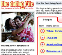
In working on TheDatingFile.com we had to deal with this very problem in particular. For example we used to have the URL shown below:
http://www.thedatingfile.com/info.php?id=4&file=straight
What does that mean? Not much to the user. Forget about attempting to type that in yourself from memory. Actually forget about even looking at it. Once the question marks and ampersands begin to appear it looks less like information and more like code.
After implementing web server features, which I’ll discuss later, here is the result:
http://www.thedatingfile.com/straight/yahoo/
This URL now actually provides the user with some information. The hierarchy is used to present the user with not only a simple overview of the content of the page but also their location in the web site.
Further Reading:
Search Engines and Friendly URLs
Google says it best in their Information For Webmasters:
We are able to index dynamically generated pages. However, because our web crawler can easily overwhelm and crash sites serving dynamic content, we limit the amount of dynamic pages we index.
Many search bots see dynamic pages as endless loops of links or blind alleys. Which many times is not the case. From a developer’s stand point, making dynamic pages can save tons of time but unfortunately search engines impose a penalty for that. Luckily there is a solution, Apache’s mod_rewrite.
Make Your URLs Friendly
Mod_rewrite has a lot of features ranging from easy to implement to the more complex. Shown below is how we made our URLs for TheDatingFile.com more user-friendly and optimized for search engines.
The following code is contained In our .htaccess file stored at the root level of the site:
RewriteEngine On<br /> RewriteRule ^(.*)/(.*)/$ /info.php?file=$1&shortname=$2 [L]
A brief explanation of what is actually going on here. We start off by telling the Apache web server to turn on mod_rewrite. The RewriteRule is what will do all the work in transforming our URLs. “^(.*)/(.*)/$” is the format in which we wish to have our URLs displayed. “(.*)” will match anything and put the contents, starting with $1, into the variable (file=$1) of our real dynamically generated page.
Further Reading:
 FourSedgewick Interactive has been hard at work revamping The Dating File and bringing it back to life. After a long hiatus we’re ready to bring the site back with a souped up engine.
The release brings along a new standards compliant design featuring XHTML 1.0 Transitional and CSS 2. As well as prominent use of PNGs and alpha-transparencies. In order to discuss the benefits of standards compliant design I’ve provided a bit of analysis between the version 4 site and the newly released version 5.
The Challenges
Being an aggregator site visitors will only spend a short period of time at the site, they may even leave before it finishes loading. That was why we needed to trim down the download time but still keep the same look and feel.
The Dating File previously sported a table based layout for presentation. Which required a lot of slicing of images to get the desired look, which left us with severe image bloat. Not to mention wasted bits on non-structure tags used for presentation.
The previous version featured unique rank, star on, star off, and join images. In order to get our color fade this was the only way possible since transparent gifs would suffer from rough edges.
The Solution
The use of valid valid XHTML markup and CSS helped reduce the tag overload induced by using a totally table based layout. Separating presentation markup from structural markup also aided heavily in terms of SEO. By presenting search engine spiders only with structurally marked upped content the site gets a better rating in terms of semantics. For instance our logo is actually an h1 tag which has a higher ranking than say an img tag.
In response to the excessive image use we capitalized on the features of the PNG format and its alpha-transparencies. The use of PNGs allowed us to trim 20 unique images down to just 4. Unfortunately our user base is primarily Win/IE users and alpha transparency images and Win/IE do not play well together. Fortunately Justin Koivisto’s IE PNG Hack provided a nice workaround which did not affect other browsers which do display PNGs correctly.
The Results
Below is a comparison between the previous version and the current version in terms of download metrics.
| Version 4 | Version 5 | | Size of webpage | <td>
19.3K
</td>
<td>
9.1K
</td>
| Visible text size | <td>
2.1K
</td>
<td>
1.2K
</td>
| Size of html tags | <td>
17.2K
</td>
<td>
7.8K
</td>
| Number of images | <td>
58
</td>
<td>
33
</td>
| Unique images | <td>
45
</td>
<td>
10
</td>
| Size of all images | <td>
27K
</td>
<td>
12K
</td>
| Grand total | <td>
46.4K
</td>
<td>
21.2K
</td>
As can be seen from the grand total we’ve optimized the site by about 46%! We’ve cut the download size almost in half, without compromising the visual display.
Related Links
 Got a little recap of the tail end of my trip to Buffalo, NY. Myself, Neera, and her mom headed up to Niagara Canada to check out Niagara-on-the-Lake, the Butterfly Conservatory, and the Falls at night.
It was good to see some of the other aspects of the Niagara area since I had already seen the Falls previously. The Butterfly Conservatory was an amazing sight to see. They’re tough to get a picture of unless if you have a high speed camera.
The Falls at night were definitely beautiful but everything seemed so candy coated with all the colored lights beamed onto the Falls. I can only imagine what coming across these falls were like before all the commercialization.
I took a few photos which can be seen in the photo gallery.
After a nasty rainstorm and a bit of traffic we finally arrived in Buffalo.
Today we headed into the city and got some chicken finger subs, a Buffalo speciality, and cruised around the city. I’ll give Buffalo credit for one thing, its got a lot of unique shops, something that is quickly fading away in Boston. Granted many of these shops only offered womens trinkets (candles, soaps, etc.).
I also got to check out Buffalo’s subway system in some degree. Unfortunately it is not something to write home about, but since I dig transit systems I will. Pretty much it has stops in the all the places you don’t want to go. From what I can gather the people are afraid of the thing. If you bring a subway stop to a thriving area, it will kill it.

