ScrollMotion Iceberg Reader 12/23/2009
Love the page slider UI in ScrollMotion’s Iceberg Reader.
Love the page slider UI in ScrollMotion’s Iceberg Reader.

It’s always a pleasant surprise to find our app icon for the LinkedIn iPhone app showing up in different places. Recently it has been popping up in illustrations [1, 2] for articles in the New York Times.
![]() One of the interesting user interface elements which Apple introduced with the iPhone was the switch control. It has a unique place on the iPhone due to its user’s primary method of interaction–a blunt index finger.
One of the interesting user interface elements which Apple introduced with the iPhone was the switch control. It has a unique place on the iPhone due to its user’s primary method of interaction–a blunt index finger.
It is not surprising that many of the points of interaction on the iPhone are over sized. Lost, is that precision of a mouse pointer. More importantly, on touch-screens, due to the size of a person’s finger, it can obscure useful information in the interface. For controls such as checkboxes or radio buttons, it can be difficult to determine whether the finger press has resulted in the desired action without having to move the finger away from the screen. As such, the switch control is a cleverly appropriate control, due to that as the user operates the switch he can see the state of the control, without removing the finger from the screen.
What is interesting to see is the influence which this control type is having on user interfaces–ones that are not on the iPhone or even on touch-screen devices. Apple itself, took this over sized control and implemented it in its new Time Machine preference pane in Mac OS X Leopard. Adobe implements it in its photo management application, Lightroom, as a means of toggling photo development options
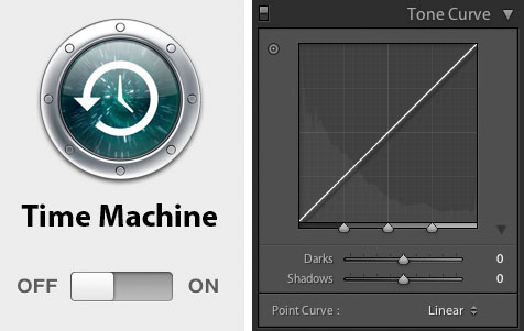
Left: Apple Time Machine, Right: Adobe Lightroom
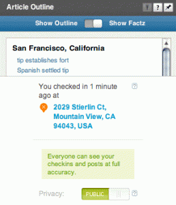
Top: Powerset, Bottom: Brightkite
The switch control is also making its way into web applications. Powerset, a new entrant in the search field, utilizes the switch control as a toggle between a wikipedia article’s table of contents and a more expanded view of the article’s sub-sections.
Brightkite, a location based social network, uses the switch as a preference control to indicate the privacy level of who can see your current location.
The switch does not provide any control that couldn’t be gained from using a select list, radio buttons, or even tabs, but it does offer a stronger visual state, one which is akin to the commonly known light switch. But like a light switch and many other physical switches, they are limited in what they can convey (i.e., on and off). Powerset’s use of the switch control certainly pushes the boundaries of how the control should be used.
The switch control is something to keep an eye out for.
I am a lover of maps. I have books about maps, my walls have been covered in maps (even a 5ft x 5ft MTA map at one point), and I’ve even written about maps. Which makes it not surprising that this past Christmas I received more than one gift which was a map.
In preparation for my move west to San Francisco my mother gave me a Streetwise waterproof folded map of San Francisco. Something to toss in my bag to always have. Yet, the more I look at the map, or rather don’t look at the map, I realize the obsolescing of this map form factor–and likely a chunk of Streetwise’s and other map makers’ business.
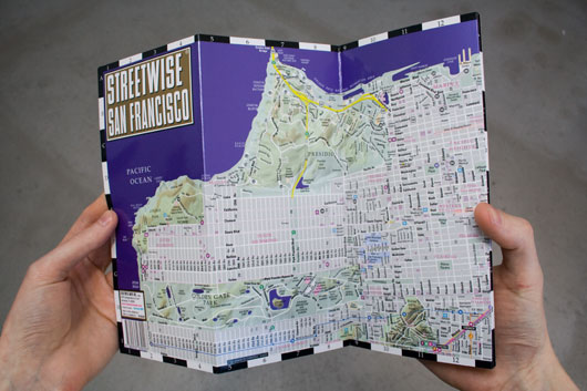
I have all but abandoned paper maps in favor of web based maps and mobile phone maps. The last bastion of paper maps, of which I carry, are small wallet sized versions of New York’s MTA map and a San Francisco transit map. As in many underground trips, getting wireless connectivity can be a challenge if not impossible–hence these wallet maps can come in handy but their days are probably numbered (BART surprisingly has a decent bit of underground wireless coverage).
Software such as Google’s Maps for mobile, with the My Location feature which repositions the map to your current location, have made orienting yourself utterly simple with no additional hardware needed. Also, interacting with the map via search has made finding any address or business all the more easy.
Even many of the traditional niche maps such as those for transit or bikes, which most people would carry in their pocket, have been converted to mobile device ready versions–iSubway Maps or Khoi Vinh’s MTA map for iPhone. We now have more than just “a thousand songs in our pockets.”
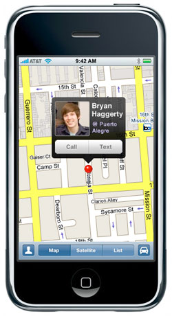
iPhone Map showing a user’s contact near them
It won’t be long before the mobile versions of maps take on a more social component as well, such as being able to see which of your friends may be in the neighborhood or at a particular restaurant or bar near where you are.
And in terms of wayfinding, people often utilize landmarks to get around. Surely, we’ll be seeing Google add their StreetView feature to their mobile edition of maps. Thus allowing users to get an actual visual of the location they’re seeking.
These are all features which no paper map could ever provide. But there are still a few paper alternatives which deserve a mention.
While I find the wallet maps still somewhat useful, SUCK UK’s Tubemap Wallet takes it one step further by turning the actual wallet into the map–clever. There is also Moleskin’s efforts to throw in a few handy maps with their pint size notebooks.
Recently I left JPMorgan Chase and New York City, to try my hand at a new locale and job. Back when I completed school, I had that cliche decision to make, New York or San Francisco–why not both. After three years in New York, it was time to give San Francisco a go. Seeking to work on more publicly facing internet products, the decision to head for the bay area was easy.
![]() And as for work, soon I’ll be joining the great folks at LinkedIn.com as a UI designer.
And as for work, soon I’ll be joining the great folks at LinkedIn.com as a UI designer.