 Tomorrow kicks off the first day of the IxDA’s first conference, Interaction 08. The sold out event marks a milestone for the young organization, as an all volunteer organization working solely for the community, they have truly brought together a lot of amazing minds. My hat is off to my friends Dave, Liya, Nasir, and the many others who have helped put together not only Interaction 08 but the many other IxDA events throughout the years.
See you in Savannah!
One of the most common ways to sell a customer on a product is to allow them to engage the user experience themselves–the try before you buy approach. It’s why electronics stores have rows and rows of TVs, sound proof stereo listening rooms, video game demo stations, and plenty more. Whether the customer makes a purchase or not, he has gotten a taste for that product, which will resonate far more than any product photo or video could.
Unfortunately, there are times though when the intentions of providing a hands on experience are stifled by elements such as over zealous anti-left systems, which can ultimately leave the customer with a negative perception of a product. This is especially the case for products such as mobile devices: laptops, digital music players, wireless phones. These are devices which are meant to be picked up, held in the hand, and moved around.
Laptops
Visiting a BestBuy or Circuit City, customers are sometimes faced with laptops which are so locked down a person can’t even comfortably rest their hands on the keyboard just to simply see how it feels–nor pick it up to feel the weight. Certainly two major points when deciding which laptop will fit that on-the-go lifestyle.
The majority of modern computing is done with the compliment of the Internet and many of these stores do not demo laptops with active Internet connections. Resulting in a demo experience which does not accurately meet a customer’s typical computer activities–Minesweeper isn’t exactly the ideal demo software.

Digital Music Players
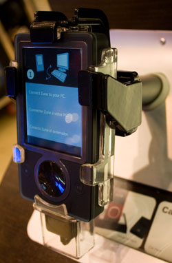
Similarly, Microsoft’s Zune digital music player demo display almost exudes an aurora of don’t touch, just look. For a device which is designed to be held in the hand, the Zune’s demo display strictly prohibits the possibility by the presence of a metal shaft where a person’s hand would rest. Proving to diminish the possibility for the customer to envision the device as part of his lifestyle. It is also encased in a plastic and metal holder, which unfortunately adds perceived size to the device. Where size is a great concern for mobile devices, this certainly does not help to convince the customer of the product’s true thinness.
One of the Zune’s major selling points is its ability to play video in a horizontal orientation allowing for a more movie-like viewing experience. Yet the demo display makes the act of trying to experience this prohibitively difficult, unnatural feeling, and ungraceful. With its awkward enforcement of allowing the device to be rotated only one way, it appears clunky.

Wireless Phones
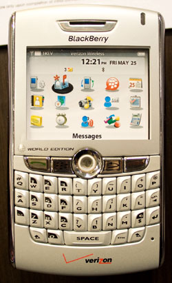
In America, wireless phone providers are in the game to sell phone service as opposed to phones, but this does not mean that providing customers with the ability to experience their offered phones should be neglected. All too often customers are shown a bolted down, gutted out phone with a sticker acting as its screen. Aside from the fact that the customer can barely hold the device in his hand, he can not even experience the user interface and actively demo those said features. This shell of a phone also all to often gives the impression of the phone being cheap in terms of quality of materials. It is no wonder American consumers assume wireless phones should be cheap in price as well.
Choosing a wireless phone becomes a blind faith decision, based mostly on wireless provider, price, and a feature list. The advancements in mobile user interfaces have been quite pitiful, much of that could be attributed to the fact that customers really have no opportunity to compare shop. Not to mention that for the majority of people, once they purchase the phone they are locked in for two years with it.
Demoing the Experience Properly
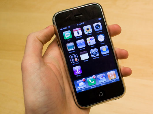
Apple is often given the gold medal for doing things right in many aspects and in providing customers with the ability to truly demo a product, they achieve it perfectly. Every iMac, MacBook, and iPod at their retail stores is free to use unrestricted–often tied down by only one unobtrusive security wire. They can be picked up, held in the hand, and used just as they would be in a customer’s real life.
It is a major factor in why Apple is able to sell so many units. A customer can walk into an Apple Store, pick up an iPhone, make a phone call to a friend, write a text message, check their email, and visit a web site. There is no blind faith decision to be made. The customer doesn’t have to buy the device first to find out how much it weighs in their hand. No contracts have to be signed before the user interface can be truly experienced.

Getting the chance to take part in the voting process doesn’t come around too frequently. It is why when it does come around, it can sometimes be a difficult process–and I’m not talking about making a decision on which candidate to support. The topic of voting machine usability is often talked about and even the UPA has attempted to take on that challenge. But an even greater part of the voting experience exists in how a voting location is structured and presented and how polling volunteers assist voters.
For almost all major elections since I became legal to vote I have voted at a different voting location. That in itself can be a challenging time, between updating my voter registration, to finding the voting location and hoping that I’m on the books. Since the time to vote comes around infrequently voters have little chance to truly become familiar with the process, especially for someone like myself where locations and type of voting machines are always changing. One can only put his faith in proper signage and the kind people who give their time to volunteer to help voters, vote.

Unfortunately, it always seems to go awry. Places such as school gyms are retrofitted to act as voting stations, multiple tables to check in, no one ever truly being sure of where you need to go. And in my case, when looking for assistance, being greeted with words such as:
Oh, here we go again. Another one who doesn’t know.
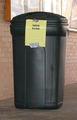
It is not surprising that often people simply choose to skip the entire process. This is no small feat to fix the problem, yet I’m not sure anyone has really put a concerted effort into actually planning and ultimately implementing changes. The pinnacle of voting location wayfinding seems to only be, “Vote Here” signs. As appreciative everyone is for the volunteers, they are lacking in the proper training to assist voters.
But, as confusing as voting can be sometimes, this is one of the only poor experiences I would say people should trudge through.
A customer’s first experience with a product is often its packaging. The customer wants to take that package home and tear it open as fast as possible–not read a manual on how to open it as is the case with Microsoft’s Vista box.

Steps to opening the Microsoft Vista box
Can’t afford that new MacBook Air? In just 38 easy steps you can get yourself setup with a new Dell laptop instead.
Dell has forgone attempting to provide the user with a simple ordering process in favor of countless upsells. The extra “components” Dell asks the user to configure range from what Adobe, QuickBooks, and TurboTax software to install to decking out the laptop with a carrying case, external mouse, and printer. While at it, throw in a matching flash drive. Don’t forget warranty, accident insurance, and premium tech support. With all this extra stuff, the user probably won’t be able to install it himself–throw in that in-home install and setup.

![]() Tomorrow kicks off the first day of the IxDA’s first conference, Interaction 08. The sold out event marks a milestone for the young organization, as an all volunteer organization working solely for the community, they have truly brought together a lot of amazing minds. My hat is off to my friends Dave, Liya, Nasir, and the many others who have helped put together not only Interaction 08 but the many other IxDA events throughout the years.
Tomorrow kicks off the first day of the IxDA’s first conference, Interaction 08. The sold out event marks a milestone for the young organization, as an all volunteer organization working solely for the community, they have truly brought together a lot of amazing minds. My hat is off to my friends Dave, Liya, Nasir, and the many others who have helped put together not only Interaction 08 but the many other IxDA events throughout the years.