As a New Yorker and avid subway fan, each day I admire the New York City subway map, designed by Michael Hertz. It is certainly a great piece of graphic design and a cultural icon of the city. Its representation of subway lines and geography is burned into many of our heads. I sought to reduce the map to its simplest form, the contouring lines which depict each subway line’s route. To remove the geographical context in order to expose the grand complexity of this weaving system of people movers.
This reduction evokes an interesting view into the history, sprawl, and the expansiveness of New York City’s subway. Through abstraction of the subway map, the often spoke of, subway as the arteries of the city, is made unequivocally clear. No borough or neighborhood is given prominence, only its veins are shown, almost like a medical illustration of the human circulatory system.
Through breaking down the gestalts of the subway map, with each layer different interpretations can be made. The map below could certainly be broken down more to emphasis different components.

 I can’t tell if I have a predisposition to sitting with walls to my right, but I seem to consistently find myself in that awkward position of trying to overextend my MacBook’s power cable to connect it the left side of my MacBook. Often the power cable is just too short or gets disconnected due to the MagSafe connector detaching as I pull it tight in an attempt to compute comfortably.
My first inclination was that due to the annoyance of this situation, I was perceiving it to occur more frequently than it actually was. But when I began to keep this mind, I was noticing this issue each time I plugged in: at the office or on my couch. Maybe I’ve set up all the spaces I work within backwards. I think it seems to come down to MacBook Feng Shui.
Earlier I had discussed the topic of only solving the surface problem instead of digging deeper into the real problem. The “Reply to All” solution has now been accompanied with other surface solutions to ‘solve’ more email problems.
As an organization that deals with sensitive information, the leaking of such information even if accidental is a major concern. And one of the possible ways this information can be leaked is via email to external addresses. In an effort to thwart this issue, a design change has been made to the email software (shown below), which requires users to specify whether their email is being sent to internal recipients or internal and external recipients. If the user fails to select that his email is being sent to external recipients, he will not receive any indication that the email was not delivered.

I cannot ascertain whether additional screening measures are performed on emails which are defined as being for external recipients, but based on communications about the changes, it appears they exist as a means of reinforcing how to properly handle sensitive information (i.e., it most likely shouldn’t be sent to external people). Certainly an odd way of communicating of this though, as users can simply always just select internal / external e-mail just to feel safe that their email will be sent. This is especially due to that by default users will be given the impression their email is being sent when in fact it essentially may have never made it past their outbox.
As an aside, the changes are having an interesting side-effect: as emailing becomes more of a pain to do, alternatives such as IM are becoming a seemingly easier option.
I have a pre-paid 30 day subway MetroCard, which means for 30 days I can swipe my MetroCard and never think about it until that 31st day rolls around and the turnstile tells me “insufficient fare”. You hate being that guy holding up the line and hate being behind the guy that that happens to. It slows the entire process down, especially when it’s the morning rush hour and there are only two turnstiles.
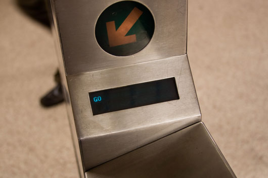
What is surprising is that the turnstiles, shown below, do provide the user with some information, but not much. Although, if you use a Pay-Per-Ride MetroCard, turnstiles actually do give you some useful information–how much money is left on your MetroCard.

Which makes it odd, due to that the turnstiles could provide meaningful information to 30 day MetroCard holders–when their MetroCard will expire. The display has the space and it obviously does know this information. Instead, users must find out the hard way on that 31st day or swipe their MetroCard at designated card checkers.
Due to that your 30 day MetroCard can start on any day of the month, having that reminder of its expiration every time you swipe at a turnstile, could save you the embarrassment or having to wait in a long line for nothing.
Sweeping the dirt under the rug, putting a new coat of paint on an old car, opting for a diet coke and calling it healthy living are all solutions to surface problems that never truly solve anything. They’re the easy and quick things that we think can actually make a difference. Just like in any other space, in software design we see solutions to surface problems passed off as answers to greater issues.
Are You Sure…
My workplace has a culture of excessive email CCing, which I’m sure exists at many other people’s companies as well. As a result, many people complain of bloated inboxes with emails which may only indirectly involve them. The probelm is the culture of blindly CCing–a result of people wanting to cover their bases, an irrelevant email to someone is easier to deal with than a missed email to someone important. And as such, an email propagates, recipients “Reply to All”–resulting in an exponential increase in email that may be irrelevant to a fair amount of people. Often this fact is made apparent by the amount of people who reply to all, pleading to be removed from the email chain. Chain is probably a good word for this too, as users literally feel they become chained to email.
So how does one solve this issue? For the IT staff it was by creating a new dialog box which prompts the user to confirm whether he truly wants to “Reply to All”. Sadly, this only attempts to solve the surface problem [people simply replying to all], as opposed to delving into the true root of the problem; that of the email culture of CCing a swath of people without regard for taking into consideration if all people need to be included. Instead, users are now left with an additional step, that solves nothing, in order to reply to an email, even if replying to all consists of only two people.

[note: The email protocol as an effective collaboration tool can be debated as a greater root problem.]
Forgot Your Password, Forget About Calling
The previous example is mostly a minor annoyance and for the most part, people will get on with their activities without much of a hiccup. A more pertinent example, which ultimately had greater consequences, involves the often challenging user authentication process. If a user who should have access can not get access, it is a major problem, one which as time elapses grows even greater. The issue at hand was that a “Forgot Password” function was taking an excessively long time to email the user the link to reset their password. As such, users, after waiting hours, assumed something was wrong and that they should call tech support. This resulted in an excessive amount of calls to the tech support call center.
What is interesting is that the call volume was perceived as the problem. First, they needed to figure out how to stop users from calling about forgotten passwords. The solution was a quick fix, a message was put in place next to the tech support telephone number:
Not for forgotten passwords
It was a very out of sight, out of mind solution. It took care of the surface problem, calls reduced, but the true problem still persisted. Users now had little recourse in finding a way to get back on track. Worse still, was that now, the people who should care don’t even hear the users since they’ve turned off that avenue of communication. Luckily, many people refused to follow the directions provided and called anyways.
Digging Below the Surface
During a user interview, a user may describe what they don’t like or why they don’t think it works. And while observing a user in a usability test it can be easy to identify what they get caught up on. The natural instinct is to “ease the pain where it hurts”, but often in software or product usability the problem’s cause could come from an array of different areas.
This isn’t news, but when design decisions such as the ones I described keep occurring it is good to remind ourselves about spending that extra time to think deeper about what we are solving.

 I can’t tell if I have a predisposition to sitting with walls to my right, but I seem to consistently find myself in that awkward position of trying to overextend my MacBook’s power cable to connect it the left side of my MacBook. Often the power cable is just too short or gets disconnected due to the MagSafe connector detaching as I pull it tight in an attempt to compute comfortably.

