Dragging and dropping files on a Macintosh has almost always felt limitless–drag a file onto an application in the dock, over a folder, onto a window, and things just work as you’d expect.
Living the dual life that I have–Mac at home, Windows at work–I often run into oddities between the two operating systems. While a long time Mac user I use my Windows computer more frequently so we can rule out the idea that I’m just too used to the Mac.
I recently attempted to take an action which I expected no resistance, dragging a JPG onto the Photoshop icon in my task bar. My thinking was that I wanted to open this file in Photoshop and what better a way than to simply drag and drop. Certainly would save me the time of clicking on Photoshop, selecting Open from the File menu and then navigating to the file’s location.

The error message I received was odd in that its tone came off almost as if they knew what I was doing was certainly what any normal person would try to do. So instead of doing what I needed, it gave me some instructions on their way of doing it. It’s strange due to that the only action which could take place, would be to open the file. Had I wished to drop the file into a particular window I would have done so.
Often I check out what some of the latest UX books have got to offer, always on the lookout to learn more. Unfortunately, recently I’ve noticed a lot of the same. I picked up Robert Hoekman’s Designing the Obvious and while well written and containing an abundance of relevant examples, I found that, like many other books on the shelves today, it seemed to be a regurgitation of everyone else’s books.
I can only take so much of half page pull quotes from the likes of Alan Cooper, Don Norman, Jakob Nielsen, and Steve Krug. They’ve all had very insightful things to say, and that is the issue; I’ve already read their books. Where am I took to indulge my learning desire?
Looking for Inspiration
The bookshelves seem to be a little too much about The Now or more appropriately, The Yesterday. I won’t lie, I miss the days of doing research and reading about ideas in their infancy–at the time questioning their relevance. That is why I was happy to come across a little feature in iTunes called, iTunes U. It is an area in iTunes dedicated solely for universities and the content they want to share with their students and, in my case, the curious public.
Most interestingly are Stanford and MIT’s offerings. Video lectures on topics ranging from HCI to Brain Structure and its Origins. Best of all, they’re cheaper and more accessible than any book.
I’ve been a BlackBerry Pearl user for only a short while, almost a year. It has its merits but my next phone probably won’t be another BlackBerry. There are more than a few quirks, but one that has always got me is so simple to solve that it seems weird it has been overlooked for so long.
The Pearl was Research In Motion’s, maker of the BlackBerry, first entrance into the multimedia phone space which includes a camera and audio, video playback–all types of media which require a fair amount of memory. With limited storage, it is not uncommon to want to know how much space you’ve got left on the Pearl’s 64 megabytes of internal memory, or 65142784 bytes as my BlackBerry prefers to tell me.
In a time where we are beginning to even forget about kilo-bytes it truly seems baffling that Research In Motion would even present the memory total and usage in bytes. I studied computer science and even I don’t want to spend the time deciding whether I want to divide that number by 1024 or 1000 to get a better idea in today’s terms of how much memory I got left.
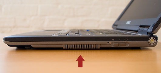
The majority of computer users use a right-handed mouse, even if you’re a left-handed, the industry has pretty much almost forced you to be a right-handed when it comes to a mouse. Which is why I’ve become a bit baffled by a design decision made by Dell in their laptops.
Laptops are becoming more and more the choice for computing over desktop computers and often people like to hook up a mouse to avoid the usable but straining trackpad. Yet when I hook up a mouse to my Dell laptop I’m greeted by one of the most uncomfortable sensations while attempting to use the laptop, a constant stream of hot air breathing down on my mouse hand from the laptop’s fan.

There are three other sides which Dell could have put the laptop’s fan on, but they decided to place it right in the spot where most people will be putting their hand as they operate a mouse. This particular Dell laptop not only has a trackpad but also an “eraser-tip” style mouse in the keyboard, seems like they really don’t want me to attach a mouse.
I’ve come up with some ingenious methods to combat this issue, many at the expense of possibly frying my company’s laptop. Often it is some kind of air funneling system created out of easily accessible office supplies.
Cheap In More Ways Than One
This is just one of the unseen costs when opting to purchase cheap products from companies that do not prioritize user experience design. Which leads to the common saying, “you get what you pay for.”
I recently acted as a “model” for the Classmate Designertypes section in Core77’s Hack 2 School Guide. I play the part of various stereotypical design students at art school. I think I managed to bring out my inner Chosen One, Dude, and Space Cadet.


