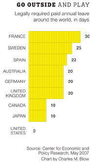
On today’s semi-mandatory day off in America, Labor Day, I thought it would be nice to take a look at that nice New York Times graph comparing the number of mandatory days off in many of the top industrialized countries.

No surprise here, us Americans seem to think even a little mandatory paid time off is too much. Yes, that’s right even today–the day to honor us hard working Americans is not truly mandatory. So stuff another hot dog down your throat and flip on the TV cause there’s nothing to worry about.
 I recently discovered that my co-workers have been secretly keeping a running list of how many usability rants I have a day. I won’t lie, it is a fairly common occurrence and an activity I recommend for anyone in the industry. Often my rants are five minute manifestos on why something is designed poorly and what needs to be changed to rectify the situation.
In order to push that agenda for designing more usable products you need to be as mad as hell and let it be known–in the politest manner possible. Being irked on a daily basis, as frustrating as that sounds, I find to be paramount in the ideation process.
In the early days it was email and today it’s the online profile. It seems these days that if you don’t have a profile on a social network you don’t really exist, at least in regards to the Internet–even my dad has one. I’ve had profiles on too many sites to remember, many of which were before the days when we called them social networks.
“You Looked Hotter On MySpace”
I was a hold out on MySpace–due to its utterly poor design. As someone in the field of user experience I felt disgusted in myself for not only finally signing up to use it, but to also promote it. Don Norman had stated in his classic book, The Design of Everyday Things that we are to send a message to companies who make unusable products by boycotting them. I knew very well I was breaking this rule when I signed up. But much like the early days of email, when people would ask “What’s your email address?”, everyone started asking “Where’s your MySpace profile?”.
Salvaging What I Could
I did everything I could to make my profile clean, trim, and easy to use. But still, I could not bare to sit through some of the most obvious user experience design problems (e.g., clicking a link to a page that requires you to login, after login should send you to the requested page!). To compound such problems, the use of third party design layouts made profiles almost outright unreadable. Autoplaying profile songs, slideshows, autoplaying movies, animated backgrounds, and countless full resolution photos; it’s like a 13 year old girl’s scrapbook but fully animated with accompanying audio. I soon identified which friends’ profiles I would never visit again. Sadly, even my own sister was on that list.
The issue with MySpace though is that they truly see no reason to solve any of these problems. They are not in the business of providing any kind of enjoyable user experience or new innovative features. Just by looking at the constant marketing AD takeovers of the site you will understand MySpace’s true goals–a marketing mouthpiece. It is not a place for friends but a place for advertising executives.
Good Bye
I may no longer be up on what new movies Twentieth Century Fox is releasing or what new beverage I should be drinking, at least I will have ended that momentary lapse in judgment.

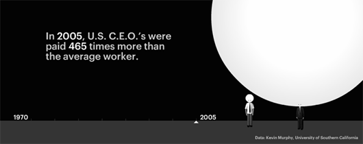
It’s apparently a good time to be the CEO, according to Portfolio.com. Most recently CEOs have been making 465 times the salary of their average worker. Compared to only 28 times in 1970.
I think this sums up the response to that age old interview question of where you want to be in 5, 10, or 15 years.
I’m a photography hobbyist, always have a camera in my bag. I’ve got lenses that range from 18mm to 135mm in zoom length and they all suit me pretty well–still on the look out for an ultra wide but that’s besides the point. Every now and then I find myself coming back to my 50mm prime lens (no variable zoom, it is what it is). I can only explain this due to that there is something about working within a specific set of constraints which inspires me. With no ability to stand in place and twist a zoom ring to adjust the frame of my photo, I’m on my feet a lot more getting closer to objects, standing on whatever is accessible. To put it plainly, I feel that I’m more creative with my shooting–less susceptible to that dilemma of greatness in choice. I have to work with what I’m given.
Similarly, I find that when designing a user experience, having constraints evokes a more stimulating thought process as you try to maneuver within what is possible. Can it be frustrating, yes, but that frustration is the basis of what spurs ideation. When it comes time to design, I’d rather have the 50mm at hand.

